I’ve been thinking about my contribution to the pop up show being held at Camberwell in November over the past couple of weeks and had a bit of an epiphany yesterday. I think the idea and timing of a pop up show is good as it’s promoting my moving from the Unit 1 research, development and practice phase to one of reflection and presentation (Unit 2). I thought about what I wanted to say and how I wanted to say it and came up with some criteria:
- Use the opportunity to do something I wouldn’t be able to do on my own
- Experiment in terms of both discourse and aesthetic
- Don’t spend too much money
- Try to create a broad statement rather than narrow one (ie evoke a sentiment about the whole experience of impairment and disability rather than focus on any singular aspect of it).
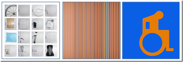
I wanted my contribution to begin to offer a sense of breadth of my approaches and yet hang together both as a discourse and aesthetically, and so reviewed some of the projects I had worked on and began to compare and contrast images to put together aesthetic statements. This was the initial result.
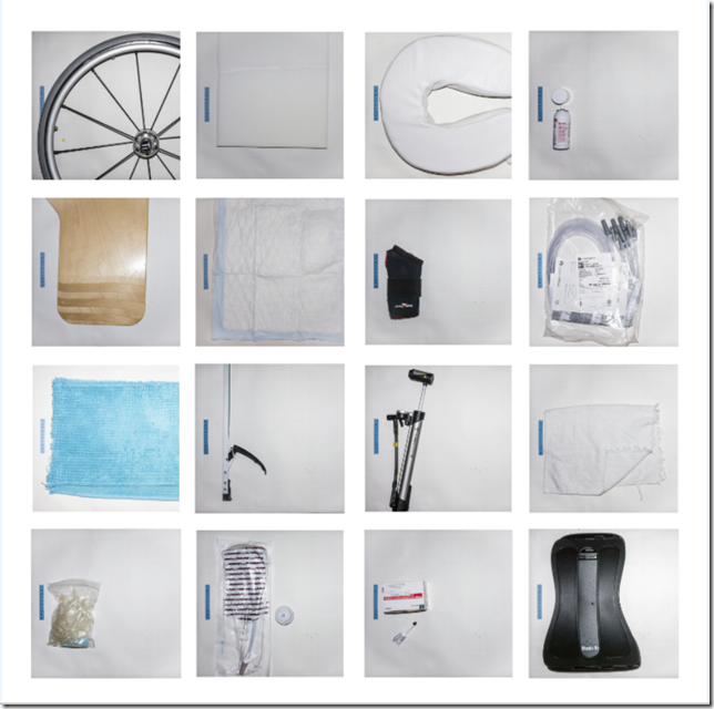
The first image is all about managing the impairment. That was my starting point.
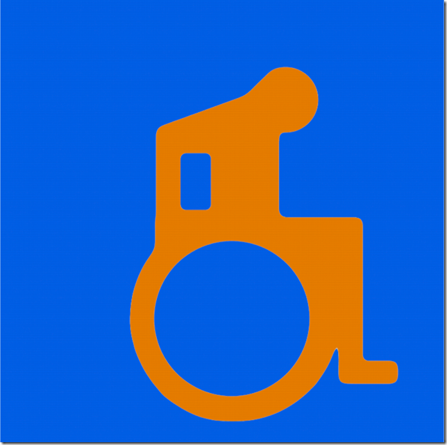
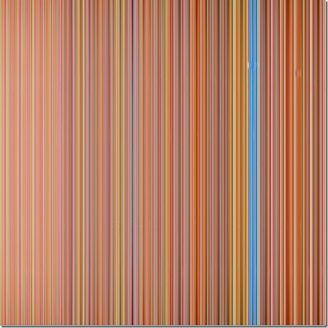
I then looked at some of the things I had created that expressed a sense of how I experience my impairment and used an abstract image I created back in February (see here) to offer a sense of that and a home made symbol I had worked on (here) to offer a sense of how society defined me. (The reason for offering my symbol was to get viewers to think about how and and why we use symbols and what effects that may have.
But while the original images worked as a discourse they did not hand together aesthetically and so I used the blue in the first image (Documented) as a reference colour and then created the other two with references to that.
What is hopefully self evident is that the images express the different ways we experience and express ourselves about the subject of disability. So, for example, the image entitled “Documented” offers a (false) sense of being a forensic image that offers real information, when it tells the viewer very little really, and certainly no more of less than the other images. “Signified” offers a commentary on the symbolism we use to alert both disabled and non disabled people to the subject. But instead of using the standard symbol I have used my very personal one. Lastly, “Interpreted” offers people a sense of how I deal with the experience both emotionally and intellectually. It presents an images that looks harmonious at first glance, but buried deep and small within it are a couple of disruptions.
Once I had gotten to this point I then considered whether they should be presented as a one piece triptych or 3 separate pieces. The decision depends on the scale I present the images at. However, when I got to this point I felt the image lacked any visceral sense – see what you think.
So I decided to experiment with some more of the images I am currently working on and added a fourth image.
This image has been heavily processed to bring out the texture of the screen and colours that connect with the rest of the set. I have also tried to keep to what I have been doing with others in the “Moving” set of images and that is get right to the edge of abstraction without falling into it. Thus here I think most people can make out that the image of of a man in a wheelchair – but only just. Thus now the set looks and reads like this below.
Documented, Experienced, Interpreted, Signified
I am not too sure about the order of the last two images yet and may change that, but overall I am content that the work speaks broadly to the whole experience of disability ranging from impairment management through to socially defined. However if I am to make the images work for me and evoke a sense of force and power I will need to present them large – maybe at 80cm square. This will also exploit some of the scale of the venue rather than presented them as one smaller quadratych.
Printing
Commercial printing is expensive and so I have not arranged for these to be printed onto fibreboard but just very heavy (260gsm) satin paper. The files sent were massive and I can’t wait to see them when back from the printer early next week.


I like the flow here and the way you have matched colour tones to create visual symmetry.
LikeLiked by 1 person
Thanks Catherine, the colours look better on Flickr and in print though.
LikeLike
Impressive Pete!
LikeLiked by 1 person