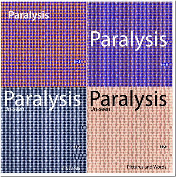
I have been experimenting with books covers – here are some of the results.
Each one of these images has its own strengths and weaknesses. Firstly, I feel the basic format works with the little symbols of people juxtaposed against the disabled family. But the colour values play an important role and I am not sure I like any of these just now. What do you think?


Hi Pete, I prefer the first one (top left) visually. My immediate reaction when I looked at the four was to be drawn to the second one – I think the reason being is that the text is more striking in a central position and also stands out best from its background, however after a few moments reflection I chose the first one as I think the overall look with the smaller text is more sophisticated. Hope this helps.
LikeLiked by 1 person
I think all these colour formats work fine, Pete. If I had to choose the stand-out one it would be top left. It’s warmer, the font doesn’t dominate and the disable family is more defined.
LikeLiked by 1 person
Hi Pete, I really like the top left too. The white images stand out better, it looks excellent.
LikeLiked by 1 person
I would say top left layout too, but with the colours of the top right maybe.
LikeLiked by 1 person
Pete, I like the top right for the color and the placement of the text-I think I like the text size but it might also look good a bit smaller too? No, on second thoughts I think I like it big! I find the color on the top left a bit gaudy and on the bottom 2 a bit bland! Lol you should never ask- you’ll get a thousand opinions!
LikeLiked by 1 person
I like the top right for colour as well.The letters do seem too large though – keep wondering what they would be like if they were scrunched together more.
LikeLiked by 1 person