Last Friday’s little exercise on scale and the weekend have given me space to reflect and so I decided to look at the images so far created around the subject of blood, remind myself of my aims and decide where to take this project. I placed the images created so far to gather and found that I did not have much more to say about these.
Blood represented Straight, Repeated, Coloured Striped, P Mansell 2015
The images work in their own ways to a degree but don’t really evoke the sense of visceral fear and intensity that I want to voice from within my aesthetic statement. But one approach did that and more.
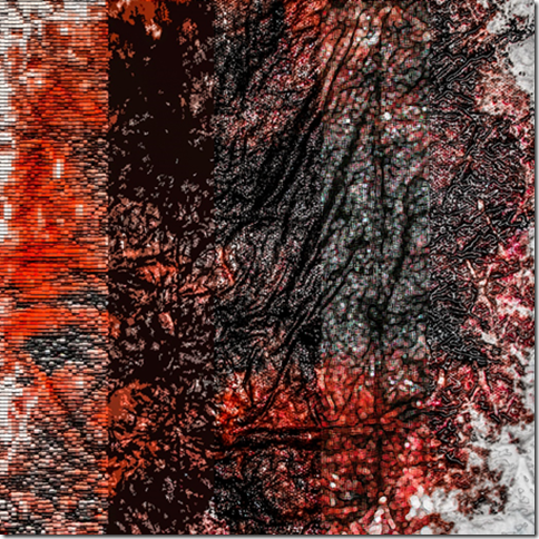
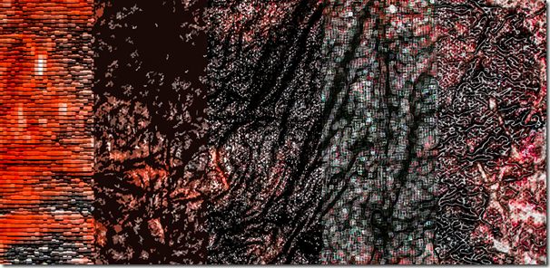
I think the closely cropped image with five different renderings presents an image close to what I want. The cropping injects and intensity while the renderings raise questions about what is presented. Scale is key here.
Moreover when the viewer gets even close to the image its transforms into an abstract of shapes, patters, textures and colours.
My only two questions are as follows:
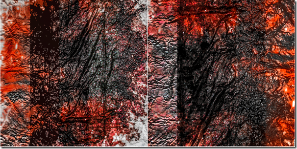
1) Whether I should crop out all the white or not. Would an approach add intensity or become too abstract? I experimented.
Blood intensity versions 1 and 2, P Mansell, 2015

Reviewing the images side by side made the judgment easier. The removal of much of the edges of the blood did intensify its impact.
The image looks like an abstract reflection on colour and tone from a distance and this changes to one about colour, texture, scale and transformation as one gets closer to it. Its label “Blood” and the context of the other images will be enough to present the discourse I want. But it’s not right for another reason and the second issue I want to address.
The second issue was raised by Jonathan in my tutorial on January 23rd and that was about applying the renderings directly using Photoshop or adjusting them using layers so that they spoke individually. Jonathan explained that when he first saw the image he recognised how the rendering had been created and if I want people to concentrate on the image and its rendering maybe adjusting them in the way he described might produce a more individualised image.
So I worked on that idea and produced the following adjusted image.
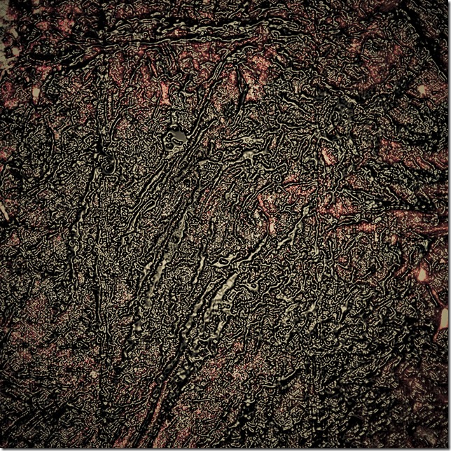
But the reworking made me question the need for multiple renderings at all and instead I began to explore a single rendering because once the image is cropped to offer the dominance of the blood I am transforming the index into something else (art) to evoke the senses I want and to re-present. So I began to work on a slightly different tack.
The first image below works better than the multiple renderings even though it doesn’t include the original realist image but it’s the second image where I have also adjusted the hue that I prefer just now as the photo does not only speak about blood on its own but shows the blood and shit with a colouration that gives the image an older less new more weary evocation that I particularly like.
The question is whether the above rendering is better than the realist one or the multiple renderings (The grid and colour grid don’t work for me). At the moment I think it does but that in so doing it no longer is clearly blood and so loses that visceral value.
What do you think?


I’ve been following this, Pete; though I have to admit that it has not been comfortable (and you don’t want it to be!). Much of it achieves the sense of fear in me, certainly, but these last two are the most overwhelming of all. Printed large on a gallery wall or as full-page bleeds (sorry, but you know what I mean) in a book, they would be very powerful images – I think. There is one aspect of them about which I can’t make up my mind – the reflection off the surface. It is less obvious in ‘1’, and that works better for me.
LikeLike
Thanks for the feedback Stan. I’m still working on them right now as I don’t think I have the visceral shock value quite right yet. But thanks for highlighting the difference in reflection within the two images – I was not conscious of that and am now.
All the best
Pete
LikeLike
Pingback: Project 7: Further experimentation and resolution | anomiepete