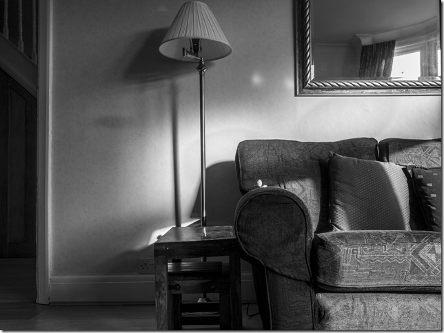
I’ve been experimenting a little with processing for current set of images to remove colour and focus more clearly on their form. This experimentation led to my including two images excluded from the colour set as they worked here as the colour values were removed.
Comparison – colour and monochrome
At present I definitely prefer this set: the monochrome treatment works as in terms of consistency and seems to work in orienting the set as a statement of facts – although the colour set seems more contemporary. I think any decision about which set to use will depend on factors such as purpose, intention, audience and method of delivery.
Yet the images may be all a little underexposed and flat, and so I think there may be some work to do.


